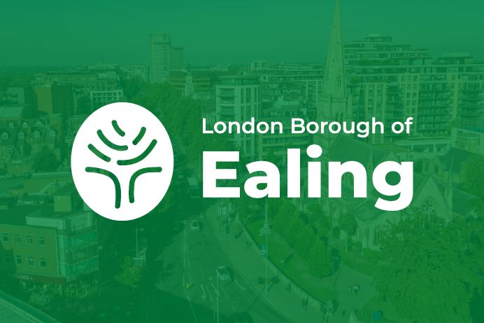
Ealing Council has got a new logo and you will start to see it appearing across its services and communications, including the council website.
The updated design has been created by the council’s in-house communications team, meaning there has been no cost to develop it. It will also be introduced over time to avoid unnecessary spending.
Why was the change needed?
The council’s old logo had been used for decades, with only minor alterations over the years. However, it was no longer fit for purpose.
It did not meet national accessibility standards that the council is required to follow and predated the development of digital media.
Keeping tradition at its roots
The new logo is still a tree, maintaining a link to the borough’s historic coat of arms. It has been created to have 7 components, reflecting the 7 towns in the borough.
The distinctive ‘fingerprint’ shape reflects that, while the council supports those distinct 7 towns and their communities, it also believes in respecting the individuality of each of the people it serves.
The wording has also changed from ‘Ealing’ to ‘London Borough of Ealing’ to reflect the whole borough, rather one town or just the council.
A gradual change
A key requirement of the new brand was that it should be produced and introduced at minimal cost. It was developed by the council’s own design team. And all signs, and logos on equipment and council vehicles, will only be replaced on an as-and-when basis – for example, when a vehicle lease comes to an end. So, there is no big change – just a gradual change when things need to be replaced anyway.
Already appearing across the borough
Residents may already have spotted the new logo on some of the council’s digital platforms, including its website and Around Ealing channels, where it has been introduced at no additional cost.
It will also appear on the new signs at Perceval House, because new signs were already planned anyway as part of the project to open up public spaces in the building for the community.